

What do your brand colors say about your business?
Why color is so important in branding, and how to choose the right colors for your business
Every color we see tells us something and evokes an emotion within us. When it comes to your business, the narrative and message behind your branding should be your primary concern, but the choice of color also plays a large and important role. Color helps to drive our perception of what a certain business or product can offer, and can be a big influence on whether we decide to buy or not.
When it comes to designing a color scheme for your brand, there are no rules set in stone. There may already be colors that are widely used in your particular industry. If you’re looking to change your branding, you have an important decision to make: whether you want to stick with what you know works well, or choose something to make you stand out from the competition.
What does your brand color say about you?
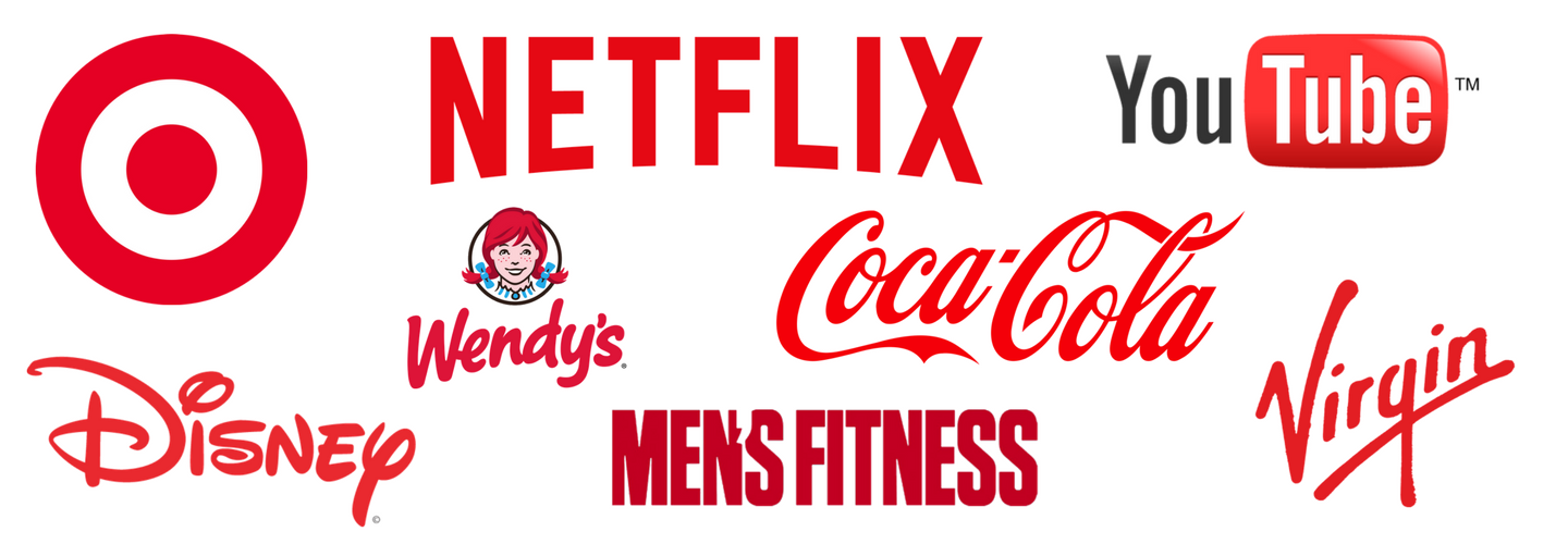
Red
Excitement, danger, strength
Commonly used for: Fitness, toys, fast food, entertainment
Orange
Creativity, confidence, energy
Commonly used for: Food and beverage, entertainment

Yellow
Optimism, warmth, attention
Commonly used for: Fast food, travel

Green
Natural, sustainable, growth
Commonly used for: Medicine, science, government, recruitment

Blue
Trustworthy, professional, safety
Commonly used for: Travel, science, technology, legal, finance

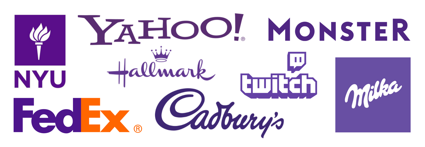
Purple
Elegant, sophisticated, wise
Commonly used for: Beauty and spa, fashion
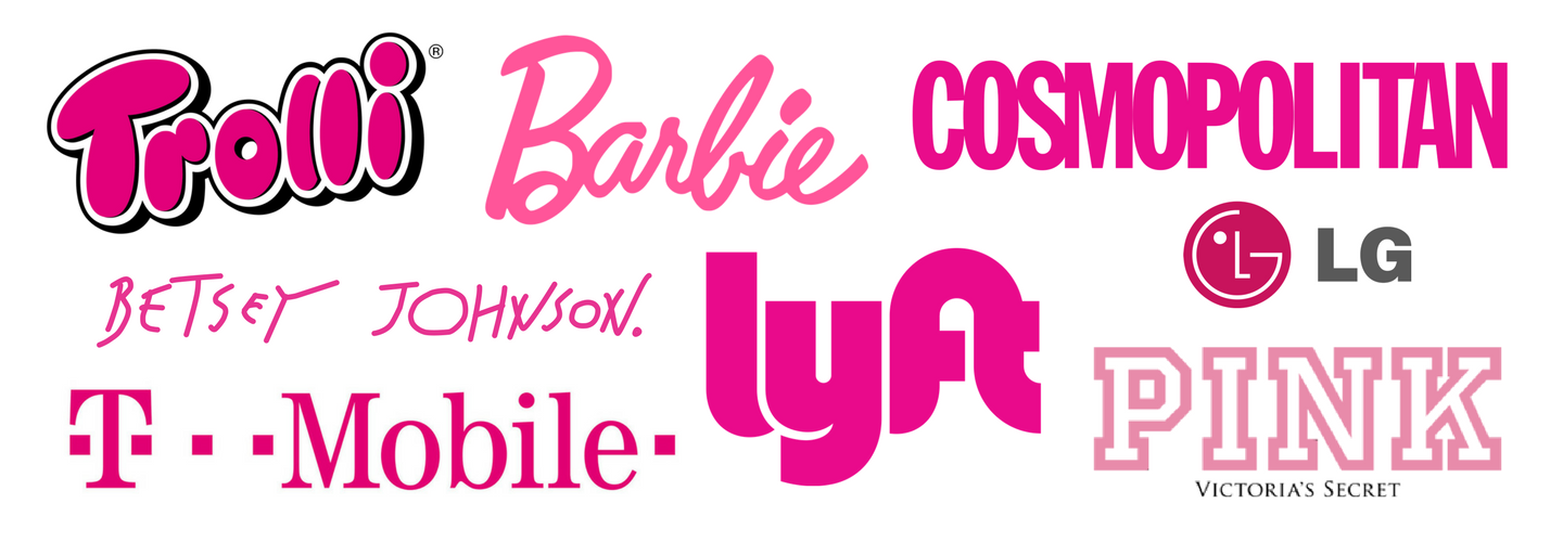
Pink
Romantic, feminine, beauty
Commonly used for: Florists, fashion
Black
Powerful, formal, luxury
Commonly used for: Construction, corporate, finance, fashion

Gray
Neutrality, balance, calm
Commonly used for: Legal, finance
![]()
White
Pure, simplicity, luxury
Commonly used for: Business services, medical, technology

How did we choose our brand colors?
“When I founded the business I had a very clear idea”, says Hugo Azzolini, President of Different Perspective, “of what I wanted the brand to communicate. We chose a vibrant orange to show our creative confidence and problem-solving abilities, and blue to convey a sense of professionalism and to establish trust. Throughout the history of the company, we have continued to use these principles to guide us.”

Want to refresh your branding?
At Different Perspective, we’re experts in branding and we have 14 years of experience helping businesses like yours. Are you ready to stand out from your competitors, establish trust and build customer loyalty? Contact us today to get started.
Read more:
Want a strong logo? Follow these 3 tips
Your potential customers are judging you by your cover
7 things you should never do to your logo


